Probability distributions
A probability distribution is any graph or function that represents the likelihood of obtaining a result from some probability experiment – such as a random-chance event, a survey of randomly-chosen individuals, an observational study. Any probability distribution has some domain and yields a range of values.
Probability distributions can be discrete, representing a countable domain, or continuous, representing an uncountable domain with an infinite number of possible values.
Here are a couple of examples of discrete probability distributions. In the first, we'll imagine that we have an "unfair" coin, one that comes up heads 75% of the time and tails the rest. Here's the discrete distribution:

Notice that the probabilities of the only two possible outcomes of this experiment (we omit the very unlikely event that the coin lands on its edge) add to 1. In other words, it's absolutely certain (probability = 1 or 100%) that one of the two outcomes will occur.
The second example is the distribution of the six possible outcomes of rolling a six-sided die. The set of possible outcomes is $\Omega = \{1, 2, 3, 4, 5, 6\}$. The capital Greek letter omega, $\Omega$, is often used to represent the set of all possible outcomes of a probability experiment. Here's the distribution:

Both of these illustrate the two characteristics that are essential for any probability distribution:
-
The probability of any individual outcome has to be postive and less than 1:
$$0 \le P(x) \le 1$$
-
The sum of all probabilities in the distribution is 1.
$$\sum_{i=1}^N P(x_i) = 1$$
Discrete → continuous
Often there's no sharp dividing line between a discrete and a continuous distribution – or at least one we can treat as continuous. This example shows the results of a U.S. Census Bureau study of the heights of American women ages 30-39. The actual discrete data is represented by the bar graph: the higher the bar, the more women (as a percent of all women 30-39) of that height. That is, the higher the bar, the greater the probability of a woman you meet aged 30-39 being that height.

You can see from the graph that the mean height is about 64 inches (5'-4"). You can see that there are about as many women taller and shorter than the average, and that the numbers of women taller and shorter than the average falls fairly smoothly away from it on either side. And there are more women of heights closer to the average than those of heights much shorter or taller than it.
The underlying curve (gray-shaded area) is a special curve we call the Normal distribution or the Gaussian distribution, and it shows what the data would likely look like if we had a very large number of data points (see law of large numbers) — and indeed this was quite a large study. We would also head toward a more continuous curve if we divided our measurement units more finely, say in increments of 1/4-inch units or smaller.
A good example of how a discrete distribution merges into a continuous distribution is the Galton board, something you might have seen in a science museum. In this example, about a thousand marbles are dropped from the triangular compartment at the top of the board through the narrow opening, randomly striking the dowels below. Most of the marbles drop in a straighter downward path, but some drop to the left and right sides – with decreasing likelihood as they get farther from the center. After many marbles drop, the pattern of the normal distribution becomes clear. This happens time after time with the Galton board, but never with precisely the same result &ndash there's always some "noise". The more marbles, the closer to normal or Gaussian the distribution of heights will be, and if we were to average the shape of the distribution over many trials, it would smooth out nicely into the continuous function that is the Normal or Gaussian distribution.

The Gaussian distribution, often referred to as the "bell curve," looks like this:

It is completely characterized by two numbers, the mean and the standard deviation $(\sigma)$, which is a measure of the width of the distribution.
Describing a distribution
Probability distributions come in all shapes and sizes. We need to be able to describe and classify them. In general, we want to know four things about any distribution:
- Shape – consider symmetry and skewness
- Center – often the mean or median The center gives us the location of the distribution in the domain.
- Spread – what extent does the data cover – what are the minimum and maximum? The spread of a distribution is usually characterized by one or both of two measures, the standard deviation $(\sigma)$ and the interquartile range (IQR).
- Outliers – are any points suspiciously far from the rest? Might we have reason not to consider them in our analysis of the data?
The acronyms SCSO or SOCS might help you remember these features.
The most common distribution of data or measurements with variations that occur by random chance is the Normal or Gaussian distribution, shown above. We'll cover its mathematical form on another page.
The height of the normal curve represents the probability of some event occuring or of finding some value of the data. High means likely and low means unlikely. The standard Gaussian curve is left-right symmetric, and the mean and median of the data are the same – right in the middle. Gaussian distributions can be very narrow or very spread out, representing high or low precision of the data, respectively.
Not all distributions are symmetric. Some are skewed one direction or another. We say that the distribution below is "skewed to the left" because it looks like it's being dragged to the left by its left-most point or "tail."

Likewise, the distribution below is "skewed to the right."

For skewed distributions, the mean of the data moves in the direction of the skewing, but the median remains closer to the peak of the curve, so the two differ as the distribution is skewed. Skewness is a key descriptor of a probability distribution.
- Right skew → mean is to the right of the median
- Left skew → mean is the the left of the median
Just as a quick example of an important skewed distribution, the distribution of atomic or molecular speeds in any sample of a gas has the Maxwell-Boltzmann distribution shown below, a distinctly right-skewed distribution that varies with the temperature of the sample.

Some distributions look quite different from the Normal distribution. They can be triangular, decaying exponentials, ... you name it. Our job will be to describe distributions as they appear.
Shape of a distribution: The center
We measure the center of a distribution in two ways, the mean and the median. When a distribution is symmetric from left to right, these are the same. It's when that symmetry fails that the median can be more useful.
Here's a simple example: Let's say that there are 25 homes in a certain community. Their values, to the nearest \$50,000, are displayed in the dot plot below.

The median housing price is just the one in the middle of a sorted list. So all we need to do to find it is to count over 13 homes from the left, and we find that the median home price in this area is \$350,000.
The mean price is just the sum of all homes divided by the number of homes. In summation notation, that's
$$\bar x = \frac{1}{25}\sum_{i=1}^{25} x_i = 350,000$$
So in this case the mean and median are the same, shown by the
Now let's do a little thought experiment. Imagine that a family comes into this community and builds a \$5-million home. What will that do to the mean and median? The graph below shows the picture. Notice that the \$5-million home is such an outlier that the horizontal axis has to have a little bit cut out to show it.

Now, as shown on the graph, the mean has shifted to a value of \$536,000, which is higher than the price of most houses in the area. In this case, the mean might not be representative of the true housing situation for a family looking to buy a home in the area.
The median home value, however, didn't change. It's the average of the 13th and 14th values, which remains \$350,000. So for a family looking to move into the neighborhood, they can be aware of that \$5-million home, but also that the price they will pay for a home will more likley be in the \$350,000 range.
This is precisely why we commonly use these two measures of the center of a distribution. When the mean and median are the same, we usually have a left-right symmetric distribution. When the mean is higher than the median, the distribution is skewed to the right, as is our wide home-value graph above. That \$5-million home really stretches the distribution out in that direction. When the mean is smaller than the median, the distribution is usually skewed to the left.
The median is more resistant to change produced by outliers – data points far outside the more clustered data.
Median
The median is the center value of an ordered list of data points. If the number of data points, $N$, is odd, then the median is the middle value. If the number of data points is even, then the median is the average of the two points in the middle.
Mean
To find the mean of $N$ data points, we sum those points and divide by the number of points. The mean is usually denoted by placing a bar over the variable name, like $\bar x$, or by the Greek letter mu, $\mu$.
$$\bar x = \frac{1}{N} \,\sum_{i=1}^N \, x_i$$
The median is more resistant to change induced by outliers – extreme values on the large and/or small ends of the distribution.
Shape of a distribution: The width
The width of a distribution corresponds to the precision of the data. A distribution that is narrow means that there is a low probability of values far from the mean or median. A wider distribution means that data points far from the middle are more probable. Consider these two distributions of the distance of each dart from the bullseye of a dart board:

The player on the left is very good. She throws near the center of the board on every throw. The player on the right isn't as good. His throws sometimes hit the bullseye, but on average they're more widely scattered.
We use two methods to measure and report the width of a distribution, the standard deviation and the interquartile range. Both are discussed in other sections (standard deviation, interquartile range), so we won't go into them in great detail here.
Standard deviation
Strictly speaking, the standard deviation (denoted by the Greek lower case "s", $\sigma$) applies only to the Normal or Gaussian distribution. It is defined as the distance along the domain axis from the mean to one of the two inflection points of the curve. An inflection point is a point on the graph where the curvature changes from concave upward to concave downward, or vice versa).
The standard deviation is the average distance of the squares of the distances of each member of a data set from the mean of that set. Here is the forumula in summation notation:
$$\sigma = \sqrt{\frac{1}{N-1} \sum_{i=1}^N (x_i - \bar x)^2}$$
We use the squares of the distances, $x_i - \bar x$, to avoid having the errors of a wide distribution cancel to a very small width, one that doesn't comport with the precision of the data. We further divide not by $N$, the number of data points – as we would when calculating a mean – but $N - 1$ instead. This is because we've essentially already used one of our $N$ pieces of data to calculate the mean, leaving only $N - 1$ left for other calculations. For more about the standard deviation, go here.
What we're doing here is calculating the sum of the squares of all of the distances of each point from the center, then dividing by the number of data points (minus one), then taking the square root to undo the earlier squaring. We could have taken an absolute value rather than squaring (after all, $|x| = \sqrt{x^2}$), but it turns out that the squaring trick makes a lot of the mathematics of statistics easier as things get more complicated.
Interquartile range (IQR)
The interquartile range (IQR) is appropriate for any distribution and not too difficult to calculate. The basic idea (see bar chart below) is that we divide the data in an ordered list into quartiles, groups that all contain, by number, one quarter of the data points. The block from Q0 to Q1 is the first quartile of the data. The median is the second (Q2 and median are synonyms), cutting the data set in half, and Q3 marks the point between the bottom 3/4 and the top quarter of the data. Of those, Q1, the median and Q3 are the important ones.

Let's use dot plot below, illustrating the number of barrels of oil recovered per year from 37 wells in an oil field, to calculate some quartiles and find the IQR.

The median (green dot) is the 19th data point, the middle one. Now dividing the data into halves, both including the median – because $N$ is odd (see gray box belo), we find Q1 and Q2 by finding the median of the lower and upper halves of the data, respectively. Those are the
Finding quartiles
Median (Q2): When the number of data points, $N$ is odd, the median is the center data point of an ordered list. When the number is even, Q2 is the average of the two center points.
Q1, Q3, $N$ odd: When $N$ is odd, divide the data in half, including the center point (Q2) in each half. Find the median of the first half; that's Q1. Find the median of the second half; that's Q3.
Q1, Q3, $N$ even: When $N$ is even, divide the data set into two halves at the median, then find the median of the first half; that's Q1. Find the median of the second half; that's Q3.
Q0 and Q4 are just the extreme ends of the sorted data list.
The IQR
For any sorted data set divided into quartiles, the IQR is a measure of the width of the set. It is
$$\text{IQR} = Q3 - Q1$$
Outliers
Often when we collect data there are one or more points that just don't seem to fit. For example, let's say we're measuring reaction times in a chemistry experiment. We run the same reaction under the same conditions ten times, finding an average time of 8.2 ± 1.1 minutes for nine of the measurements, but a time of 21 minutes for the tenth. That last measurement just doesn't look right — it's an outlier, and we might be correct to think about what might have gone wrong with our technique. We might be tempted to throw that datum out of our data set. Would we be justified?
It's important to have some objective measure of what constitutes an outlier, some criterion that we all agree upon. One such criterion is the 1.5 IQR rule. It works like this:
-
A data point is an outlier to the left if it is less than 1.5 times the IQR to the left of the first quartile (Q1).
$x \lt \text{Q1} - 1.5 \cdot \text{IQR} $
-
A data point is an outlier to the right if it is greater than 1.5 times the IQR to the right of the third quartile (Q3).
$x \gt \text{Q3} + 1.5 \cdot \text{IQR} $
Let's look at our oil barrels example above and ask whether there are any outliers. For this data set, Q1 = 35 and Q3 = 65, so the IQR is 30 units. The condition for outliers on the left is
$$ \begin{align} x &\lt \text{Q1} - 1.5 \cdot \text{IQR} \\[5pt] x &\lt 35 - 1.5 \cdot 30 \\[5pt] x &\lt 35 - 45 \\[5pt] x &\lt -10 \end{align}$$
There are no values less than -10, so there are no outliers to the left. Likewise, the condition for outliers on the right is
$$ \begin{align} x &\gt \text{Q3} + 1.5 \cdot \text{IQR} \\[5pt] x &\gt 65 + 1.5 \cdot 30 \\[5pt] x &\gt 65 + 45 \\[5pt] x &\gt 110 \end{align}$$
There are no values greater than 110, so there are no outliers to the right, either; this data set has no outliers.
Example 1
Consider the dot plot showing the distribution of 52 scores on a chemistry test. Describe the distribution in terms of its shape, center, spread and outliers (SCSO).

The center of the distribution can be measured in two ways: by calculating the mean and/or by finding the median. To find the mean, we just sum the values and divide by their number to get 70.9. The median is the average of the 26th and 27th data points, for a value of 70. The mean is just a bit larger than the median, confirming just a little bit of rightward skew.
The first and third quartiles are the averages of the 13th and 14th points (Q1 = 62.5) and of the 39th and 40th points (Q3 = 80). The IQR is then 80 - 62.5 = 17.5. We can check for outliers:
-
Left:
$$ \begin{align} x &\lt Q1 - 1.5 \cdot \text{IQR} \\[5pt] x &\lt 52.5 - 1.5(17.5) \\[5pt] x &\lt 26.25 \end{align}$$
There are no scores less than 26.25, so there are no outliers on the left.
-
Right:
$$ \begin{align} x &\gt Q3 + 1.5 \cdot \text{IQR} \\[5pt] x &\gt 80 + 1.5(17.5) \\[5pt] x &\gt 106.25 \end{align}$$
There are no scores greater than 106.25, so there are no outliers on the right, either.
The spread of the data is between scores of 45 and 100, inclusive.
Because this data looks at least vaguely Normal with the mean approximately equal to the median, a Normal analysis is appropriate. Thus the standard deviation of the mean is $\sigma = 11.7$.
Uniform probability distribution
Note: the math after the heading "Average and variance" goes a little bit beyond what you might have encountered so far. If you can't follow it, just move on; that's OK.
The uniform probability distribution is one in which the probability of any outcome of a probability "experiment" is the same. A good example is the rolling of a single fair die, where "fair" means an equal chance of rolling 1, 2, 3, 4, 5 or 6.
The probability of rolling a 1 is the same as that for rolling a 2 or 3, 4, 5 or 6. For each there is a 1 in 6, or ⅙ chance. We can sketch a graph of these discrete outcomes like this:
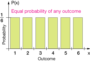
Now any probability distribution must also capture the idea of an assured outcome, that is, that when the experiment (tossing the die) is performed, one outcome is assured. The die will come up with a result that is in the set of possible outcomes.
The total probability must sum to 1. In this case, we have six possible outcomes, each with a ⅙ probability, so the total area of our rectangular probability distribution graph (below) is 1. We would refer to this as a normalized distribution.

In mathematical notation, we'd write the sum of all six of the probabilities as
$$\sum_{i=1}^6 \, P_i = 1$$
Coin tossing is another example of a probability experiment with a uniform distribution of outcomes. There is a ½ probability of tossing heads and a ½ probability of tossing tails, the only two possible outcomes (we can approximate the probability of a coin landing on its edge to zero). The two probabilities sum to 1.
We might also have a uniform distribution of continuous outcomes, where our probability experiment could give any result between x = a and x = b, with equal likelihood, as in the graph below.

This is the most general representation of the uniform distribution. Notice that the height of the graph, which is the uniform probability, is fixed at b-a because we require the sum of all of the probabilities to be equal to one. That's what we call a normalized probability distribution.
Average and variance
Now let's derive formulas for the average and variance $(\sigma^2)$ of this distribution. The average, $\bar x$, of a distribution over a range $[a, b]$ is obtained by doing a little calculus:
$$ \begin{align} \bar{x} &= \frac{1}{b - a} \int_a^b x \, dx \\ \\ &= \frac{1}{b - a} \frac{x^2}{2} \bigg|_a^b \\ \\ &= \frac{1}{2(b - a)} (b^2 - a^2) \\ \\ &= \frac{1}{2(b - a)} (b - a)(b + a) = \bf \frac{a + b}{2} \end{align}$$
That's just what we'd expect: add the high and the low and divide by two.
The variance of a discrete distribution is
$$\sigma^2 = \frac{1}{N} \sum_{i = 1}^N (x_i - \bar{x})^2$$. You can look over the details of calculating the variance of a continuous distribution below – it uses a little bit of calculus. The result is
$$\sigma^2 = \frac{(b - a)^2}{12}$$
Click to show details of σ2 derivation
For our continuous distribution, we integrate that definition on the interval [a, b]:
$$ \begin{align} \sigma^2 &= \frac{1}{b - a} \int_a^b (x - \bar{x})^2 \, dx \\[5pt] &= \frac{1}{b - a} \int_a^b \left[ x - \frac{a + b}{2} \right]^2 \, dx \\[5pt] &= \frac{1}{b - a} \int_a^b \left[ x^2 - 2x \left( \frac{a + b}{2} \right) + \frac{(a + b)^2}{4} \right] \, dx \\[5pt] &= \frac{1}{b - a} \left[ \frac{x^3}{3} - x^2 \left( \frac{a + b}{2} \right) + \frac{(a + b)^2 x}{4} \right]_a^b \\[5pt] &= \frac{1}{b - a} \left[ \frac{b^3 - a^3}{3} + (a + b)\left( \frac{a^2}{2} - \frac{b^2}{2} \right) + \frac{(a + b)^2}{2} (b - a) \right] \\[5pt] &= \frac{b^2 + ab + a^2}{3} - \frac{a^2 + 2ab + b^2}{2} + \frac{a^2 + 2ab + b^2}{4} \\[5pt] &= \frac{4b^2 + 4ab + 4a^2 - 6a^2 - 12ab - 6b^2 + 3a^2 + 6ab + 3b^2}{12} \\[5pt] &= \frac{b^2 - 2ab + a^2}{12} = \bf \frac{(b - a)^2}{12} \end{align}$$
Mean and variance of a continuous distribution
The mean of a continuous distribution defined on the interval $[a, b]$ with probability $P = \frac{1}{b-a}$ is
$$\bar x = \frac{a + b}{2}$$.
The variance of a such a continuous distribution is
$$\sigma^2 = \frac{(b - a)^2}{12}$$
Example 2 – uniform distribution
Let's say we have a shoe store that sells pairs of shoes with a uniform probability of a sale throughout a seven-day week. That is, it's equally probable that a pair of shoes is sold on Monday as on Tuesday. The minimum number of pairs sold per week is 50, and the max is 250. Calculuate the probability of selling between 100 and 150 pairs of shoes. Calculate the mean and standard deviation, $\sigma = \sqrt{\sigma^2}$ of the distribution.
$$P_{100-150} = (150 - 50) \cdot \frac{1}{250 - 50} = \frac{100}{200} = \frac{1}{2}$$
The mean of the distribution is
$$\bar{x} = \frac{a + b}{2} = \frac{50 + 250}{2} = 150 \; \text{pairs}$$
Finally the variance is
$$ \begin{align} \sigma^2 &= \frac{(b - a)^2}{12} \\ \\ &= \frac{(250 - 50)^2}{12} = 3,333 \\ \\ &\text{so }\; \sigma = \sqrt{3333} = 58. \end{align}$$
The mean is $150 ± 58 \text{ pairs}$
Mean & variance of a continuous distribution
The
The

First we ought to normalize our PDF. That means ensuring that the area underneath it over its domain is equal to 1. ere's the process:
$$ \begin{align} f(x) &= a(1 - x^2) \tag{1} \\[5pt] a \int_{-1}^1 \, (1 - x^2) dx &= 1 \tag{2} \\[5pt] a \bigg[ x - \frac{x^3}{3} \bigg]_{-1}^1 &= 1 \\[5pt] 2a \bigg[ x - \frac{x^3}{3} \bigg]_0^1 \tag{3} \\[5pt] 2a \bigg[ 1 - \frac{1}{3} \bigg] &= 1 \\[5pt] 2a \bigg[ \frac{2}{3} \bigg] &= 1 \\[5pt] \frac{4}{3} a &= 1 \\[5pt] a &= \frac{3}{4} \end{align}$$
So our normalized PDF is
$$f(x) = \frac{3}{4} (1 - x^2)$$
$$ \begin{align} \mu &= E(x) \\[5pt] &= \int_a^b \, x f(x) \, dx \\[5pt] &= \int_a^b \, x(1 - x^2) \, dx \\[5pt] &= \int_a^b \, (x - x^3) \, dx \\[5pt] &= \bigg[ \frac{x^2}{2} - \frac{x^4}{4} \bigg]_a^b \\[5pt] &= \frac{b^2}{2} - \frac{b^4}{4} - \frac{a^2}{2} + \frac{a^4}{4} \\[5pt] \mu &= \frac{b^2 - a^2}{2} - \frac{b^4 - a^4}{4} \end{align}$$
Just to check, let's think about a symmetric interval, with $a = b$. Then we have
$$\mu = \frac{a^2 - a^2}{2} - \frac{a^4 - a^4}{4} = 0,$$
which is what we expect for the mean of our distribution on a symmetric interval around zero.
The
The

The
The
The
The Bernoulli & Binomial distributions
Often we encounter situations in which our data answers a yes-or-no question. For a coin flip, for example, the result can either be heads or "not heads." It's a binary situation, at least if we disregard the exceedingly-small possibility of the coin landing on its edge. The Bernoulli* and binomial distributions are suitable for modeling probability experiments that ask such yes-or-no questions.
For our coin flip, we might write the probability of tossing heads as P(H), then the probability of tails is P(!H), which we read as "not H," or "not heads." Further,
$$P(H) + P(!H) = 1.$$
The Bernoulli distribution need not represent 50/50 probabilities. It could also be used to model the behavior of a non-fair coin like one that came up heads 75% of the time, in which
$$ \begin{align} P(H) &= 0.75 \\[5pt] P(!H) &= 0.25 \\[5pt] P(H) + P(!H) &= 1 \end{align}$$
Here's that distribution as a bar graph:

If we let the yes-event = 1 and the no event = 0, the average value of the Bernoulli distribution is
$$\bar{x} = 1(0.75) + 0(0.25) = 0.75$$
Binomial distribution
The Bernoulli distribution is the distribution for one binary event, as in the 75/25 coin flip above. The binomial distribution is the distribution for $n$ trials of such a binary event. For example, if we flipped our 75/25 coin 100 times and plotted the results, that would be a binomial distribution.
The details of the binomial distribution will be left for another section, but briefly, the mean of a binomial distribution is
$$\mu = np$$
where $n$ is the number of trials and $p$ is the probability of an event occuring. The variance is
$$\sigma^2 = np(1-p)$$
*
Mean and variance of a binomial distribution
The mean of a binomial distribution with probabilities $p$ and $1-p$ and $n$ iterations of the experiment is $\mu = np$.
The variance is $\sigma^2 = np(1-p)$.
The normal or Gaussian distribution
The curve under the bar graph above has a familiar "bell" shape. It's often referred to as a bell curve, but more often as the normal distribution or the Gaussian distribution, after Carl Friedrich Gauss.
The curve is a probability distribution. You can always read its meaning by imagining that the vertical axis is a measure of the relative probability or likelihood of something happening and that all of the somethings are arrayed in order along the x-axis.
The Gaussian curve is aways symmetric on either side of its maximum, and the maximum is the mean or average value. Whatever value or event is in the middle is the most likely. That "event" in our women's height example would be the "event" of being 5'-4" tall. Out in the "wings," probability is the lowest: There are far fewer very short and very tall women, and the probability of being short or tall is lower than being of more average height.
If we add up all of the probability under a Gaussian curve, we should get one (or 100%), the probability that something — anything at all — happened. Often we scale a Gaussian curve so that its total area — the area under the curve — is one. That's called "normalizing" the distribution.
Here's another example before we move on. The graph below shows the results of 5000 simulated throws of two dice. The sum of both dice is shown. Notice that because there are more ways to come up with a total of 7 (6+1, 5+2, 4+3),it's the most probable throw. After 5000 throws, the dice-total distribution looks pretty "normal."

Notice that in this example, we're not graphing probability but number of occurrences of a total, but the two should have the same shape. The sum of the heights of the green bars should be 5000, the total number of throws. Likewise, throwing a 2 or a 12 is less likely than throwing a 7.
We could normalize this distribution by dividing each value column value by the sum of all columns. This would give us the percent chance (if we multiplied by 100) of each throw, and it would sale the graph but maintain its shape. In the graph below, the green bars are the normalized simulated curve, and the purple bars are the exact expectations (see law of large numbers) we'd expect for a very large number of throws.

So where does that curve come from?
That's a tricky question. It comes from modeling random chance, but the functional form of the curve has to be derived using calculus. In particular, it is derived using the second fundamental theorem of calculus. We don't need to go there just yet, though; the result will serve our needs just fine. Here's what the Guassian function / Normal function looks like, with some explanation of its parameters.
This function might look complicated, but think of the first part as a constant prefactor. Then the exponential function is a symmetric bell-shaped curve that's translated by -h units along the x-axis and scaled by the 2σ2 in the denominator.

The
discrete
Discrete means individually separate and distinct. In mathematics, a discrete varable might only take on integer values, or values from a set {a, b, c, ... d}. In quantum mechanics, things the size of atoms and molecules can have only discrete energies, E1 or E2, but nothing in between, for example.
The Greek alphabet
| alpha | Α | α |
| beta | Β | β |
| gamma | Γ | γ |
| delta | Δ | δ |
| epsilon | Ε | ε |
| zeta | Ζ | ζ |
| eta | Η | η |
| theta | Θ | θ |
| iota | Ι | ι |
| kappa | Κ | κ |
| lambda | Λ | λ |
| mu | Μ | μ |
| nu | Ν | ν |
| xi | Ξ | ξ |
| omicron | Ο | ο |
| pi | Π | π |
| rho | Ρ | ρ |
| sigma | Σ | σ |
| tau | Τ | τ |
| upsilon | Υ | υ |
| phi | Φ | φ |
| chi | Χ | χ |
| psi | Ψ | ψ |
| omega | Ω | ω |
continuous
In math and science a set is continuous if it contains an infinite number of values between two endpoints.
The set S = {1, 2, 3, 4} is discrete because it has a countable number of members (four). The set S = (0, 1) is a continuous set of all possible numbers between 0 and 1, not including the endpoints. If two numbers from that set are specified, we can always find another between them.

![]()
xaktly.com by Dr. Jeff Cruzan is licensed under a Creative Commons Attribution-NonCommercial-ShareAlike 3.0 Unported License. © 2016-2025, Jeff Cruzan. All text and images on this website not specifically attributed to another source were created by me and I reserve all rights as to their use. Any opinions expressed on this website are entirely mine, and do not necessarily reflect the views of any of my employers. Please feel free to send any questions or comments to jeff.cruzan@verizon.net.